 Divi is currently Elegant Themes most powerful and advanced WordPress theme and it’s just been upgraded with the largest upgrade in its history. Divi gives you building blocks that you can use to create interesting layouts and content areas. You can add text, sliders, maps, blurbs, accordions, pricing structures, and much more. You can create virtually any type of website you need. And of course it’s responsive.
I’ve been a Divi user since the first day it was released. In this article I share my thoughts about Divi and take a look at what’s new in version 2.4.
What’s New in 2.4
Divi 2.4 is the foundation of ET’s future product line. It has over 1000 module design and customizer settings and adds some interesting features:
- Global Settings – easier to make site-wide adjustments
- Fluid Grid – the page layout doesn’t have fixed widths. With fluid grid you can create your own widths.
- Advanced Builder Settings – every module has advanced CSS settings from a simple UI.
- Divi Library – advanced layouts.
Theme Options
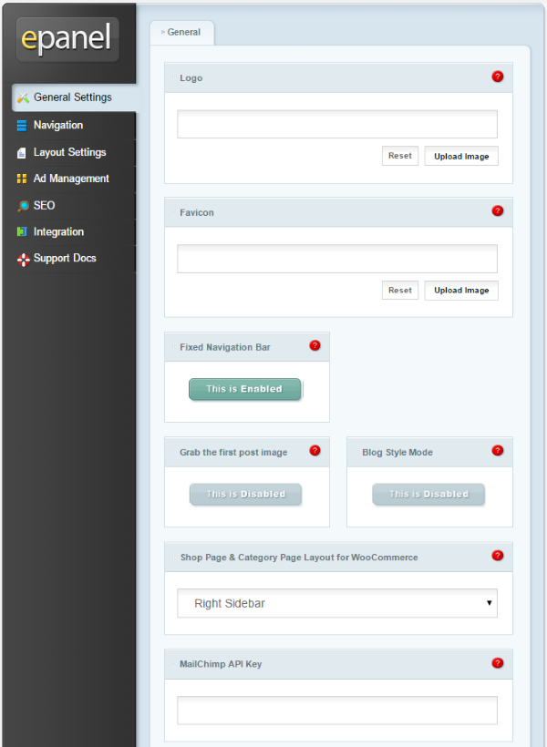
All ET themes use an options screen called epanel. The features of the epanel change depending on the features of the theme. Divi’s epanel is extensive. It has the basics, such as logo, favicon, fixed navigation bar, grab first image, blog style, number of posts to display, etc. It adds a lot of options that include:
- WooCommerce Shop Page
- MailChimp key
- Aweber authorization
- Social media icons
- Social media URL’s
- Google Fonts
- Smooth Scrolling – allows next row and its contents to fade in on scrolling
- Responsive Shortcodes
- Back to Top button
- Custom CSS
- And more
Navigation settings include pages, categories, home link, drop-down menu, etc. It has layout settings, ad management, SEO customization, advanced code integration, and documentation. You can do a lot of customizations just from the epanel.
Theme Customizer
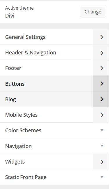
The theme customizer works from the front end and adds lots of sliders to adjust font sizes, styles, rows, buttons, colors, animations, header size, footer size, background image, and lots more. You can make all of your adjustments and see the effects as they occur (WYSIWYG – what you see is what you get).
You can place your contact info and social links in the header. The header is an especially good choice for businesses as it places important info front and center, and it stays on the screen when readers scroll down. It also includes layout and topography. Just like standard customizations, you can choose navigation, widgets, and a static front page.
It even lets you adjust mobile settings for tablet and phone, and each one is independent of all other settings and each other. You see the effects in a screen that simulates the mobile device so you can see what it looks like before you publish. This is a nice feature because you don’t have to get a mobile device just to check how the site looks with the adjustments you just made. I’m really glad to see this included.
Module Customizer
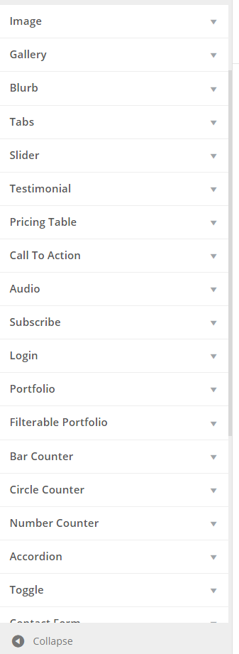
You can customize the look of the modules on the front end using the Module Customizer. Customizations include sliders for sizes, widths, heights, etc. You can also choose fonts, styles, animations, actions, etc.
Divi Library

The Divi Library contains layouts that you’ve created. You can edit any of your layouts and create new layouts from this menu.
The Divi Builder
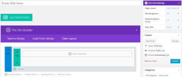
The real magic of Divi happens when you use The Divi Builder. You use this by selecting the button labeled Use The Divi Builder above the visual editor. The previous edition had Page Builder, which only worked with pages. Divi Builder works with all post types.
- Divi also adds post settings to your editor so you can choose the page layout, dot navigation, hide nav, and hide the post title on each post if you want.
You can load a page layout or modify the default layout. A layout is made up of sections with rows and columns. Modules are then placed in the columns. You can change the layout by dragging and dropping any section, row, column, or module.
Sections
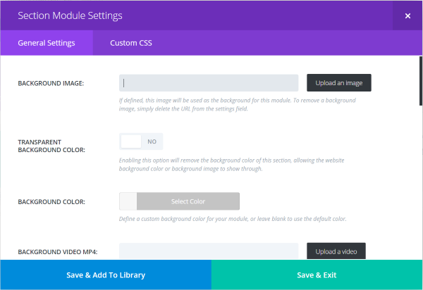
Sections can be added, deleted, cloned, and modified. You can modify how the background looks and reacts, add a background image, make the background transparent, choose its color, play a video, choose its overall size, whether or not it can be paused by other players, whether it has an inner shadow, if it uses a parallax effect, and set special CSS. Using these setting you can make the same simple layout look unique.
You can also create a clone of each section – complete with the same rows, modules, content, and settings. Of course you can then modify the new section any way you want.
There are four different types of sections. You can add a standard section, full-width section, specialty section, or add from the library.
Rows
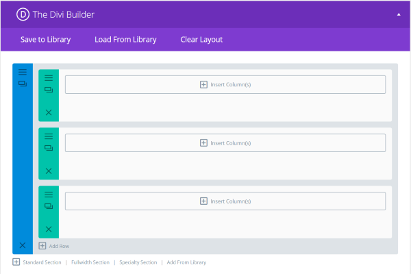
You can add new rows and modify existing rows. Columns can then be placed on the rows, building your layout.
Columns
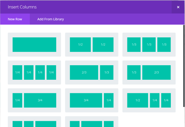
These columns are where the modules will be added. There are 11 different column layouts to choose from.
Specialty Sections
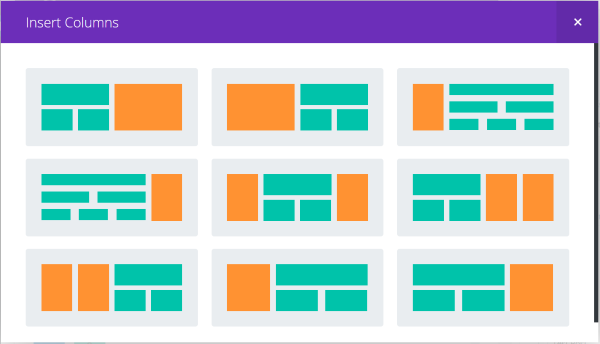
There are also 9 specialty column layouts. These include various options for sidebars.
Load From Library
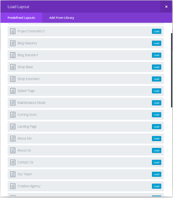
You can load layouts from the 32 predefined layouts or layouts from what you’ve created. Each one can be modified. The layouts include various number of columns, grids, carousels, side bars, home pages, shops, corporate, portfolios, blogs, maintenance mode, coming soon, landing page, sales page, case studies, product features, about pages, contact pages, shopping pages, and more.
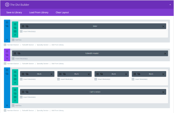
Your page is built by laying down rows, placing columns within those rows, and then placing modules in those columns. You can add new rows, move rows by drag and drop, or delete rows. Pre-made layouts have these already made for you. I chose Homepage Basic and it gave me a layout with a slider, header, four blurbs, and a call to action.
Modules
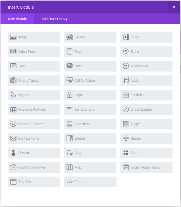
Modules are special content types (like widgets). You can add new modules, drag and drop them in any order you want, or delete them. You can also add various types of content. You can have as many modules as you want and use them in any combination you want. You’re not limited in how many times you use the same module. For example, if you want a screen full of maps, just add as many map modules as you want.
There are 40 modules:
- Full-width Header
- Full-width Menu
- Full-width Slider
- Full-width Portfolio
- Full-width Map
- Full-width Code
- Full-width Image
- Full-width Post Title
- Image
- Gallery
- Video
- Video Slider
- Text
- Blurb
- Tabs
- Slider
- Testimonial
- Pricing Table
- Call to Action
- Audio
- Signup
- Login
- Portfolio
- Filterable Portfolio
- Bar Counters
- Circle Counter
- Number Counter
- Accordion
- Toggle
- Contact Form
- Sidebar
- Divider
- Person
- Blog
- Shop
- Countdown Timer
- Map
- Social Media Follow
- Post Title
- Code
That’s plenty enough modules that you can create some interesting layouts and features for your website. Modules is one of the strengths of Divi. By placing modules in columns you can literally create a layout that is uniquely yours. Using modules, Divi will let you create just about any kind of site you want.
Each module has their own settings. Most of them have an editor, advanced design settings, and CSS settings, so you can add their content and modify their look and feel. Here is a look at a few modules and their features:
Text
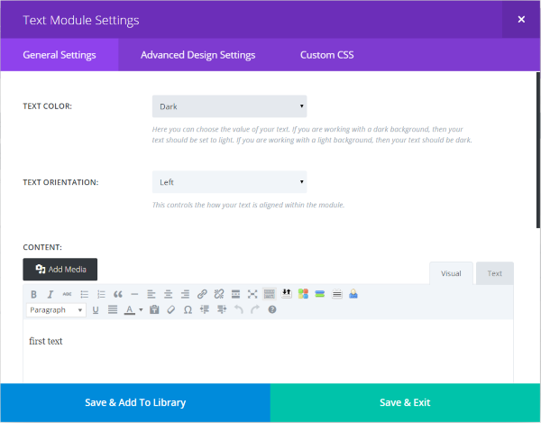
Text gives you the basic editor and selections for text color and orientation, advanced design settings (sliders for widths, heights, colors, margins, etc.), and custom CSS. Most of the modules include these or similar features.
Blurb
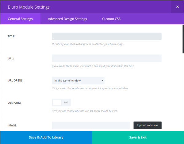
I clicked on Blurb to see what kind of content I could add. Here I can give it a title, URL, determine how the URL works, give it an icon, choose colors, fonts, ext., and then add content using the standard TinyMCE editor. The advanced design settings include the same settings as the text module but with an added image setting.
Map
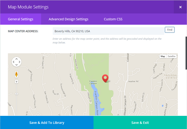
Map gives you a nice map that you can display as regular map (with or without terrain) or see it in satellite view (with or without labels). You can add pins so you can highlight specific locations on the map. You just type in the address and select to add new pin. The advanced settings give you a greyscale filter with percentage controls.
Blog
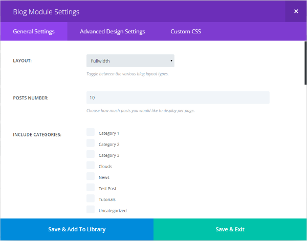
The Blog module is interesting. It allows you to place blog posts within a single column of any width of your choice. The reason I like this is you can have a static front page and still display your blog posts from specific categories that you choose. You can show as many as you want and you can show an excerpt, author name, date, categories, pagination, featured image, read more button, and more. This would make an interesting magazine-style layout. It includes the same advanced design settings as the text module but with some extra settings for background colors and headers.
Post Title
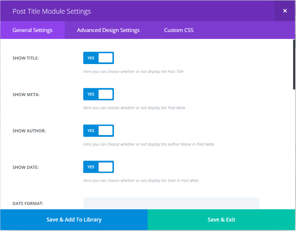
This is one of the new modules. It lets you design the look of the post title and choose what’s included and what’s not. The advanced design features are mostly the same as the text module with a few extra settings such as background color.
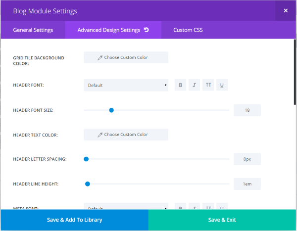
Here’s a look at the advanced design settings for the post title module.
Using Divi as a Regular Theme
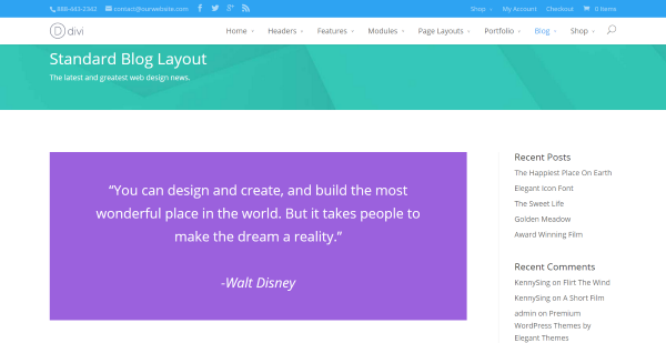
Of course you don’t have to use any of these features. You can just use Divi like you would any other theme. Simply choose the setting you want in the epanel and create content like normal – using the standard editor. This makes a simple and clean website or blog that’s elegant enough to use as-is.
Language Support

Divi has built-in support for over 30 languages and can be translated into others. This includes the front end and the builder, which even displays from right to left when an RTL language is enabled.
Getting Divi
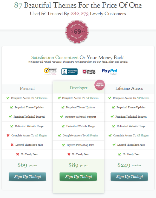
Divi is part of ET’s Personal Plan which costs $69 per year and includes access to all themes, perpetual updates, support, and unlimited usage. If you cancel your subscription you get to keep everything you’ve downloaded from ET.
Divi alone is worth that price in my opinion (especially when you consider that most themes of this caliber cost much more than this), but when you consider that includes 87 themes and counting, joining Elegant Themes for at least one year is a no-brainer.
Further Down the Road
The next releases on ET’s agenda is the Divi Builder plugin, a magazine theme called Extra that will share the same building elements but with a magazine layout focus, and then Divi 3.0. It’s clear that ET is fully committed to the success of Divi and the Divi builder platform. Now that I’ve seen Divi 2.4 I can’t imagine the improvements and features in Divi 3.0.
Divi Builder Plugin
One downside to Divi is once you’ve created a page layout you can’t switch themes without recreating the pages and posts. ET has solved this with a free plugin that maintains the layout no matter what theme you’re using. You get to keep all of your layouts and modules even if you don’t use a theme from ET. This plugin should be available soon.
Final Thoughts
Divi can create complex layouts but it’s still easy to use. It doesn’t have a large learning curve. You can easily add elements and drag and drop them anywhere you want to create your very own custom layouts and modify their look with sliders. They can be as complex or as simple as you want them to be.
It might take some time to get your layout the way you want but at least you can save your layouts as templates or use pre-made layouts which can save you a lot of development time. It’s easier than ever to make advanced-style adjustments and every setting has an undo button so you don’t have to worry about making mistakes. Sites made with Divi look impressive on any device and they load fast. I highly recommend Divi 2.4 from Elegant Themes.
Learn More About Divi and Download Here
How about you? Have you tried Divi? Was your experience anything like mine? Do you have something to add? Tell us about it in the comments below.